skip to main |
skip to sidebar
Still life photography is a genre by itself. Derived from the old masters and their paintings, photographers collect stuff to photograph it. The still life has no fixed rules of right and wrong and gives an incredible freedom in lighting and composition. Some things should however be kept in mind when trying to make a still life that stands out.A themeA still life should be more than just a collection of thingies. The vast majority of great still lifes has a theme. It could be anything: a profession, a season, any activity. a song title, a color, the list is endless. The main point is, that the items in the still life should be presented in a theme, and be consistent within the theme. Cornucopia still lifes for instance implement abundance, so they require a lot of items. ICT still lifes would become inconsistent if done against a very natural or classical background. Table shotsMost good still lifes are table shots. That is, the camera is at the same height as the scene is, or just a little higher. This camera standpoint provides a natural looking perspective, altough in real life, we would not look at most of these things horizontally. I do know of a couple of successful exceptions to this rule, so it's no fixed rule. Like always, deviating from the rules provides an extra handycap, but it can work out great.Composition, background and lightingThe freedom in composing a still life is endless. One can use any composition rule, combine a couple of them or ignore them all together. Combinations of the rule of thirds with other rules are often used, but again, feel free to break the rules as you go.Background and lighting are free too, but they should not attract too much attention and be consistent with the theme. Neutral backgrounds are okay, but if the still life has a nautical theme, why not use a nautical map as a background? If it is too distracting, use a shallow depth of field to tune down it's presence. White backgrounds are fine too.Still lifes often use light tents are a single light source that suggests natural light through a window (often using fill lights or reflectors as well). But if you feel backlight works better, why not give it a try? As long as all the relevant details are revealed properly and the lighting does not distract from the the, it's fine.
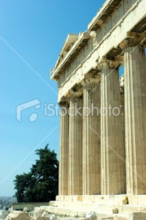 One of the main challenges in photography is trying to capture three dimensions in a two-dimensional frame. A picture, either on paper, on canvas, or an screen, has no depth. It is up to the photographer to suggest depth. Last week’s article, on shallow depth of field, showed you one way to suggest depth. This week’s article is about a composition technique called vanishing point.
I don’t know about you, but the very first thing I learned when drawing perspective, is to place a point on the horizon. All the horizontal lines in the drawing should the lead to this point. This technique creates the suggestion of perspective and hence depth. Photography is not the same as drawing obviously, but photographers use many tricks that drawers thought of first. This is one of them. The difference is that the photographer does not have to place a point on the horizon. The point is already there, the photographer only has to recognize it. How? By following horizontal lines. All horizontal lines pointing into the photo seem to lead to one point. That point is the vanishing point.
Having multiple lines aiming at a single point gives a picture depth in the exact same way as it is done in drawings. Buildings are always glad to provide horizontal lines leading to a vanishing point. The picture of the Parthenon clearly shows how it works. Similar powerful lines toward the vanishing point may be found in rails and railroads. Note that the point itself does not have to be visible. It doesn’t even have to be in the picture. The mere suggestion of the point is sufficient to give depth to your picture.
More resources
DPChallenge Vanishing point Challenge (lots of examples)
Cropping, or cutting the edge from a picture in post processing, may sometimes come as a useful trick to improve your composition or to remove unwanted elements from your picture. Cropping may also be used to change the aspect ratio of your pic, and hence change its impact. The aspect ratio is defined as the ratio between the longest and the shortest side of your pic. Changing your aspect ratio has implications for the composition of your pic. Some combinations work better than others.
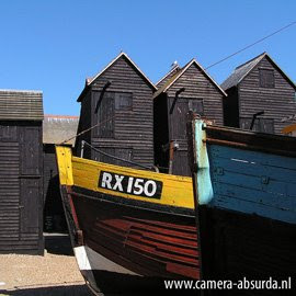 1:1
1:1
The square format is often used in medium format cameras as well as in many Lomo (often using medium format film cameras. This gives a picture a traditional feel. Depending on the pic, a professional or experimental look that the picture already had, may be enhanced by the square crop. If some site or contest prescribes a maximum size for the longest side, you may want to maximize total pic size by using the square crop. Likewise, the visibility of a square thumbnail in a large group of thumbnails is better. Square pics work well with centered compositions, spirals and portraits. For portraits, center the pic at the vertical axle, and put the eyes on 2/3rd.
3:2
The 3:2 (or 6:4) aspect ratio is commonly used for 35mm film and for some medium formats. Magazines very often use this format as well, as do many books and postcards. People will immediately recognize 3:2 as a photograph, and it will make your pic look as if it was taken with a SLR-camera. (which doesn’t mean a thing, but some people tend to equate SLR to ‘professional’). Pictures with an aspect ratio of 3:2 work great with the rule of thirds and with all composition rules using diagonals (leading lines, S-curve, vanishing point, etc).
4:3
Most modern digital compact cameras use the 4:3 aspect ratio. This ratio is also very common for TV- and computer screens. Some people have the feeling that the 4:3 landscape looks more familiar than a 4:3 portrait. This does make sense, as TVs and computer screens are hardly ever in the portrait position. Some books and magazine use the 4:3 aspect ratio in portrait though. The 4:3 aspect ratio seems to fit almost any composition.
 16:9
16:9
The 16:9 aspect ratio is derived from wide screen televisions and –before that- from movie theatres. No wonder it has a somewhat luxurious impact and no wonder it looks so weird in portrait. This aspect ratio goes very well with landscape shots and with shots that could have been movie stills.
More resources:
Wikipedia on aspect ratios
DPChallenge Square crop challenge results (2006)

